Social Media Design Trends: A Practical Workshop
A hands-on workshop on the hottest trends in social media design. We build posts in Figma and Photopea while practising the most popular effects and compositions.
Welcome to our graphic design workshop! 🎉 Today we move on to applying specific effects to our graphics.
The goal is to design one professional-looking social media post — a 1080×1080 px or 1080×1350 px Instagram square, for example. We will work in Figma and Photopea. I will show you how to achieve particular modern effects, and your job is to adapt them live to your own design.
Rather than making "something", we will work from concrete examples.
The goal: your social media post
Pick one of the three briefs below (or propose your own). It will be your starting point for experimenting with the trends we practise today.
Brief 1: Tech & Premium
- Company: "Quantum Audio"
- Product: the new Q-PRO 7 wireless headphones with active noise cancellation (ANC).
- Audience: tech-savvy professionals, audiophiles, people who value focus.
- Core message: "Mute the world. Sink into the sound." or "Your private zone of quiet."
- Style: modern, clean, premium, technical, minimal but with character.
Brief 2: Eco & Craft
- Company: "Green Essence"
- Product: a local speciality coffee roastery introducing a new single origin from Ethiopia.
- Audience: coffee lovers, people who value craft, eco-friendly products and high quality, the local community.
- Core message: "Discover the authentic taste of Ethiopia. Freshly roasted beans, available now."
- Style: organic, warm, authentic, artisanal, trustworthy — textures welcome.
Brief 3: Summer Music Festival
- Event: "SummerWave Festival" (a summer festival of alternative and electronic music).
- Subject: announcing the first release of tickets for the coming edition.
- Audience: music fans aged 18–35, people who care about atmosphere, new sounds and time spent outdoors.
- Core message: "Feel the vibe. The first SummerWave tickets are on sale."
- Style: energetic, typographic, dynamic, either vivid colour or a strong two-colour contrast. Perfect for bold fonts, aurora gradients, patterns and photo masking.
Brief 4: Your idea
- Have your own vision for a post? Want to make a poster for a favourite band or event, promote your portfolio, or build something for a friend's business? Go ahead.
Presentation
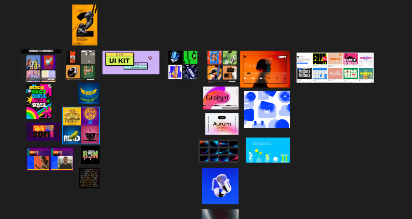
Figma link — click to see the examples
Exercise: effects and styles to use in your work
During the session I will show you how to reach each of the effects below quickly. We will practise them in the order given, and you will try to weave them into your own design.
1. High contrast / neubrutalism
Strong saturated colours (often pure black plus one neon or primary colour), simple shapes, and hard, unblurred shadows.
- How? (Figma): pure colours (#000000, #FFFFFF, #FF0000), simple layouts, shadows with 0% blur.
2. Masking
Creative use of images and typography — text "filled" with a photo, or a photo cut out into an unusual shape.
- How? (Figma/Photopea): use a shape or text as a mask for the image layer. In Figma the function is "Use as Mask".
3. Minimalism
The art of saying a lot with very little. What matters here is whitespace, precise typography and a deliberate visual hierarchy.
- How? (Figma): plenty of empty space, one strong colour accent, clean typography.
4. Aurora / blur gradient
Very soft, flowing colour transitions reminiscent of the northern lights. Ideal for creating depth and organic backgrounds.
- How? (Figma): several coloured ellipses plus a "Layer Blur" effect at a very high value (150–250).
5. Noise / texture (grain)
Adds analogue character and depth. It breaks up perfectly smooth digital surfaces.
- How? (Photopea/Figma): apply the "Noise" filter in Photopea, or lay a ready-made noise texture over the design in Figma with a blend mode of "Overlay" or "Soft Light".
6. Glassmorphism
Elements that look like semi-transparent frosted glass sitting on a colourful background.
- How? (Figma): a shape with reduced fill opacity (20–40%) plus a "Background Blur" effect.
7. Bold fonts
Treating text as the main graphic element rather than an addition. The letters become the image.
- How? (Figma): use large, expressive typefaces (serif or sans) as the centrepiece of the composition, often with very tight leading or a creative arrangement.
8. Pattern
Using repeating elements (icons, shapes) to build an interesting background or frame.
- How? (Figma): create a simple component (an icon, say) and repeat it on a regular grid, or use a plugin for generating patterns.
How will we work? (our workflow)
- Choosing a brief (10 min): decide which subject you will take on and find one or two photos or assets to use.
- Setup (5 min): prepare a file in Figma (an artboard of 1080×1080 px).
- Working through the effects together (about 75 min): this is the main part. I will demonstrate each effect live, starting with high contrast. Your job is to follow my steps while adapting the techniques to your own design — your colours, fonts and photos.
- Q&A and presentation (the remaining time): a short review of a few pieces, questions and feedback.
Summary
Today's class is not an exam — it is a playground. The point is to get your hands dirty in Figma and Photopea, test some new techniques, and see that modern, complicated-looking effects are often within easy reach.
Next steps
In the following classes we can take it further:
- Turn static posts into simple animations (GIFs or short videos).
- Design a whole mini campaign (three consistent posts plus a Stories sequence).
- Go deeper into UI design — a landing page for one of these products, for instance.
Useful links (inspiration)
- Pinterest — unbeatable for building moodboards (search: "social media design trends", "neubrutalism graphic design", "aurora gradient").
- Behance — high-quality projects (search for "social media design").
- Dribbble — quick hits of inspiration, great for UI and effects.
- Unsplash / Pexels — free high-quality photos for your work.
Questions? Problems? Write to me at m@zeprzalka.com
Ready to go? 🚀 Let's start!