Project: Your First Responsive Page (Landing Page)
Wrapping up the HTML and CSS basics. Step by step we build a complete, responsive landing page for Tesla, combining semantic HTML, Flexbox, Grid and media queries.
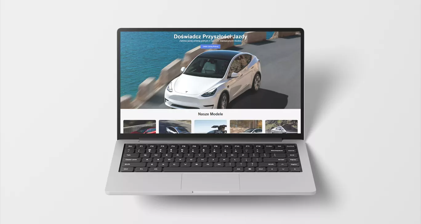
Welcome to our first big project! 🎉 This is where everything we have learned so far comes together. In recent classes we practised building individual sections — a responsive hero and a card grid. Now we combine those pieces, add new ones (a form and a footer) and build a complete, professional landing page from them.
Our goal is a product page for Tesla that looks right on every device, from a phone to a large monitor. Let's begin.
🚀 The project plan
Before we write a single line of code, let us make a quick plan. Our landing page will consist of four logical sections, matching the semantic HTML5 tags:
- Hero section (
<section class="hero">): a large, attention-grabbing background image with the main slogan and a call to action encouraging an order. We will use Flexbox (optionally) to centre the content perfectly. - Models section (
<section id="models">): a responsive grid of five cards presenting different Tesla models. A perfect job for CSS Grid and its "magic" properties. - CTA / form section (
<section id="order">): a simple contact and order form. Here we consolidate what we know about<form>,<label>and<input>. - Footer (
<footer>): a standard footer with copyright information.
🛠️ Step 0: Global preparation (global styles)
Before we start building, let us prepare our style.css. We begin with two key things that follow on from the CSS lesson:
- A
box-sizingreset: the basis of layout, makingpaddingandbordercount toward an element's width. - Basic
bodystyles: a global font, no default margins, and a background colour.
/* style.css */

/* --- Global reset and basics --- */

/* Set the default box-sizing for every element */
* {
  box-sizing: border-box;
  margin: 0;
  padding: 0;
}

body {
  font-family: Roboto, Helvetica, Arial, sans-serif;
  /* line-height: 1.4; */ /* Improves readability */
  background-color: #f4f4f4;
  color: #1d1d1d;
}

/* A shortcut for responsive images */
img {
  max-width: 100%;
  display: block;
}

/* A global button style */
.btn {
  display: inline-block;
  padding: 12px 24px;
  background-color: #333;
  color: #fff;
  text-decoration: none;
  border-radius: 5px;
  transition: background-color 0.3s ease;
}

.btn:hover {
  background-color: #3e6ae1; /* Tesla's colour */
}
📝 Step 1: The page skeleton (HTML)
First let us create the full semantic structure in index.html. It is empty for now, but it already describes precisely what sits where. Note the use of <main> to wrap the primary content.
<!DOCTYPE html>
<html lang="en">
<head>
<meta charset="UTF-8" />
<meta name="viewport" content="width=device-width, initial-scale=1.0" />
<title>Order Your Tesla - Official Landing Page</title>
<link rel="stylesheet" href="css/style.css" />
</head>
<body>
<main>
<section class="hero">
<div class="hero-content">
<h1>Experience the Future of Driving</h1>
<p>Book a test drive in one of our revolutionary models.</p>
<a href="#order" class="btn">Book a Test Drive</a>
</div>
</section>
<section id="models" class="container">
<h2>Our Models</h2>
<div class="card-grid">
<article class="card">
<img src="/img/model-s.avif" alt="Tesla Model S" />
<div class="card-content">
<h3>Model S</h3>
<p>A saloon with the longest range and remarkable performance.</p>
</div>
</article>
<article class="card">
<img src="/img/model-3.avif" alt="Tesla Model 3" />
<div class="card-content">
<h3>Model 3</h3>
<p>
The most popular electric saloon in the world. Within everyone's
reach.
</p>
</div>
</article>
<article class="card">
<img src="/img/model-x.avif" alt="Tesla Model X" />
<div class="card-content">
<h3>Model X</h3>
<p>
The safest and most versatile SUV in history.
</p>
</div>
</article>
<article class="card">
<img src="/img/model-y.avif" alt="Tesla Model Y" />
<div class="card-content">
<h3>Model Y</h3>
<p>A compact SUV combining space with efficiency.</p>
</div>
</article>
<article class="card">
<img src="/img/cybertruck.avif" alt="Tesla Cybertruck" />
<div class="card-content">
<h3>Cybertruck</h3>
<p>
Tougher than a pickup, more capable than a sports car.
</p>
</div>
</article>
</div>
</section>
<section id="order" class="cta-form">
<div class="container">
<h2>Book a Test Drive</h2>
<p>Fill in the form and one of our consultants will be in touch.</p>
<form action="/submit-form" method="POST">
<div class="form-group">
<label for="name">Full name:</label>
<input type="text" id="name" name="name" required />
</div>
<div class="form-group">
<label for="email">Email address:</label>
<input type="email" id="email" name="email" required />
</div>
<div class="form-group">
<label for="model-select">Choose a model:</label>
<select id="model-select" name="model">
<option value="s">Model S</option>
<option value="3">Model 3</option>
<option value="x">Model X</option>
<option value="y">Model Y</option>
</select>
</div>
<button type="submit" class="btn">Send</button>
</form>
</div>
</section>
</main>
<footer>
<p>© 2025 Tesla Project. Built for educational purposes.</p>
</footer>
</body>
</html>
🎨 Step 2: Styling the sections (CSS)
We have a solid HTML skeleton. Time to add styles to style.css, section by section.
Section 1: Hero
We want this section to take up almost the whole screen, with a background image and perfectly centred content (optionally). Flexbox is the ideal tool here.
/* --- Section 1: Hero --- */

.hero {
  /* We use vh (viewport height) so the section takes 90% of the screen */
  min-height: 90vh;

  /* The background - replace 'hero-bg.webp' with your own image */
  background-image: url("/img/hero-bg.webp");
  background-size: cover; /* The image always covers the whole element */
  background-position: top; /* Anchored to the top so the text stays legible */

  /* Flexbox magic for centring the hero content
  display: flex;
  justify-content: center;
  align-items: center; */

  /* Text styles for a dark background */
  color: #fff;
  text-align: center;
  padding: 20px;
}

.hero-content h1 {
  font-size: 2.5rem; /* A large, readable title */
  font-weight: 600;
  text-shadow: 2px 2px 8px rgba(0, 0, 0, 0.5); /* A shadow for legibility */
}

.hero-content p {
  font-size: 1.2rem;
  margin-bottom: 1.5rem;
  text-shadow: 1px 1px 4px rgba(0, 0, 0, 0.4);
}

/* Adjust the button inside the hero */
.hero .btn {
  background-color: #3e6ae1;
  font-size: 1.1rem;
}

.hero .btn:hover {
  background-color: black;
}
Section 2: Responsive cards (CSS Grid)
This is the key part. We want a grid that adjusts the number of columns to the space available. On a phone there will be one column, on a tablet two, on a desktop three or four — without a single media query.
💡 We will use repeat(auto-fit, minmax(300px, 1fr)). What does that mean?
repeat(..., ...): creates repeating columns.auto-fit: automatically fit the number of columns to fill the available space.minmax(300px, 1fr): every column must be at least 300px wide. If there is more room, it stretches to take an equal share (1fr — one fraction).
/* --- Section 2: Cards (models) --- */

/* The .container class adds side margins on larger screens */
.container {
  /* max-width: 1200px; */ /* The container's maximum width */
  margin: 0 auto; /* Centres the container */
  padding: 2rem; /* Inner spacing for the section */
}

/* We rarely style by ID, but there are cases where it is acceptable */
#models h2 {
  text-align: center;
  font-size: 2.5rem;
  margin-bottom: 2.5rem;
}

.card-grid {
  display: grid;
  /* Here is the responsiveness magic, with no media queries */
  grid-template-columns: repeat(auto-fit, minmax(300px, 1fr));
  gap: 2rem; /* The gap between cards */
}

.card {
  background-color: #fff;
  border-radius: 10px;
  box-shadow: 0 4px 12px rgba(0, 0, 0, 0.05);
  overflow: hidden; /* Clips the image's corners */
  display: flex; /* Optional */
  flex-direction: column; /* Optional */
  transition: transform 0.3s ease, box-shadow 0.3s ease; /* Hover animation */
}

.card:hover {
  transform: translateY(-5px); /* Lift the card slightly */
  box-shadow: 0 8px 16px rgba(0, 0, 0, 0.1);
}

.card img {
  width: 100%;
  height: 400px; /* A fixed image height */
  /* height: 250px; */ /* An alternative height */
  object-fit: cover; /* The image fills the space without distortion */
}

.card-content {
  padding: 1.5rem;
  flex-grow: 1; /* Stretches the content so cards match in height */
}

.card-content h3 {
  margin-bottom: 0.5rem;
  font-size: 1.5rem;
}
Section 3: The CTA form
Styling forms mostly comes down to giving the inputs 100% width so they fill the container neatly, and styling the button.
/* --- Section 3: CTA form --- */

.cta-form {
  background-color: #fff;
  padding: 40px 0;
}

.cta-form h2 {
  text-align: center;
  font-size: 2rem;
  margin-bottom: 1rem;
}

.cta-form p {
  text-align: center;
  margin-bottom: 2rem;
  font-size: 1.1rem;
}

/* Limit the form's width and centre it */
form {
  max-width: 600px;
  margin: 0 auto; /* Centre the form */
}

.form-group {
  margin-bottom: 1.5rem;
}

.form-group label {
  display: block; /* The label sits above the field */
  font-weight: bold;
  margin-bottom: 0.5rem;
}

/* Shared styles for inputs and the select */
.form-group input,
.form-group select {
  width: 100%;
  padding: 12px;
  border: 1px solid #ccc;
  border-radius: 5px;
  font-size: 1rem;
}

/* Style the button so it fills the width */
form .btn {
  width: 100%;
  text-align: center;
  font-size: 1.1rem;
  background-color: #3e6ae1;
  border: none; /* Remove the default border */
}

form .btn:hover {
  background-color: #333;
  color: #fff;
}
Section 4: The footer
The footer is the simplest element — padding and centred text.
/* --- Section 4: Footer --- */

footer {
  text-align: center;
  padding: 2rem;
}
📱 Step 3: Manual responsive touches (media queries)
Thanks to CSS Grid our layout is already 90% responsive. On very small screens, though, the <h1> in the hero section may be too small.
We will use a media query to enlarge it only on screens wider than 768px. This is the mobile-first approach.
/* --- Responsive touches (media queries) --- */

@media (min-width: 768px) {
  /* Enlarge the hero typography on tablets */
  .hero-content h1 {
    font-size: 3.5rem;
  }

  .hero-content p {
    font-size: 1.5rem;
  }

  /* Enlarge the section titles */
  #models h2,
  .cta-form h2 {
    font-size: 2.5rem;
  }
}
🏆 Project summary
Congratulations! You have just built a complete, responsive landing page from scratch.
What did we practise?
- Semantic HTML: using
<main>,<section>,<article>and<footer>to build a logical structure. - The box model: a global
box-sizingreset saved us a great deal of time. - Flexbox: we used it to centre the hero content perfectly.
- CSS Grid: we built an automatically responsive card grid (
auto-fit+minmax). - Forms: we created and styled a basic contact form.
- Media queries: we used them to fine-tune typography on desktop.
This is the foundation the whole of modern web development rests on.
Next steps
Practise what you have learned on a different example. Try finding another simple landing page online and coding it by hand. Only then move on to design systems, frameworks and other tools that speed the work up. A good grasp of the fundamentals is a key part of learning in this industry. Practice makes perfect.
Questions? Problems? Write to me at m@zeprzalka.com
Great work! 🚀