Building UI - Your Own Spotify: a Music Player in Next.js
A hands-on interface exercise. We use Shadcn UI components and a little Tailwind magic to build a responsive music player card.
Hello! 👋
Last time we met what I consider the three most important technologies of the modern frontend: Next.js, Tailwind CSS and shadcn/ui. We already know how to set up an environment in the cloud.
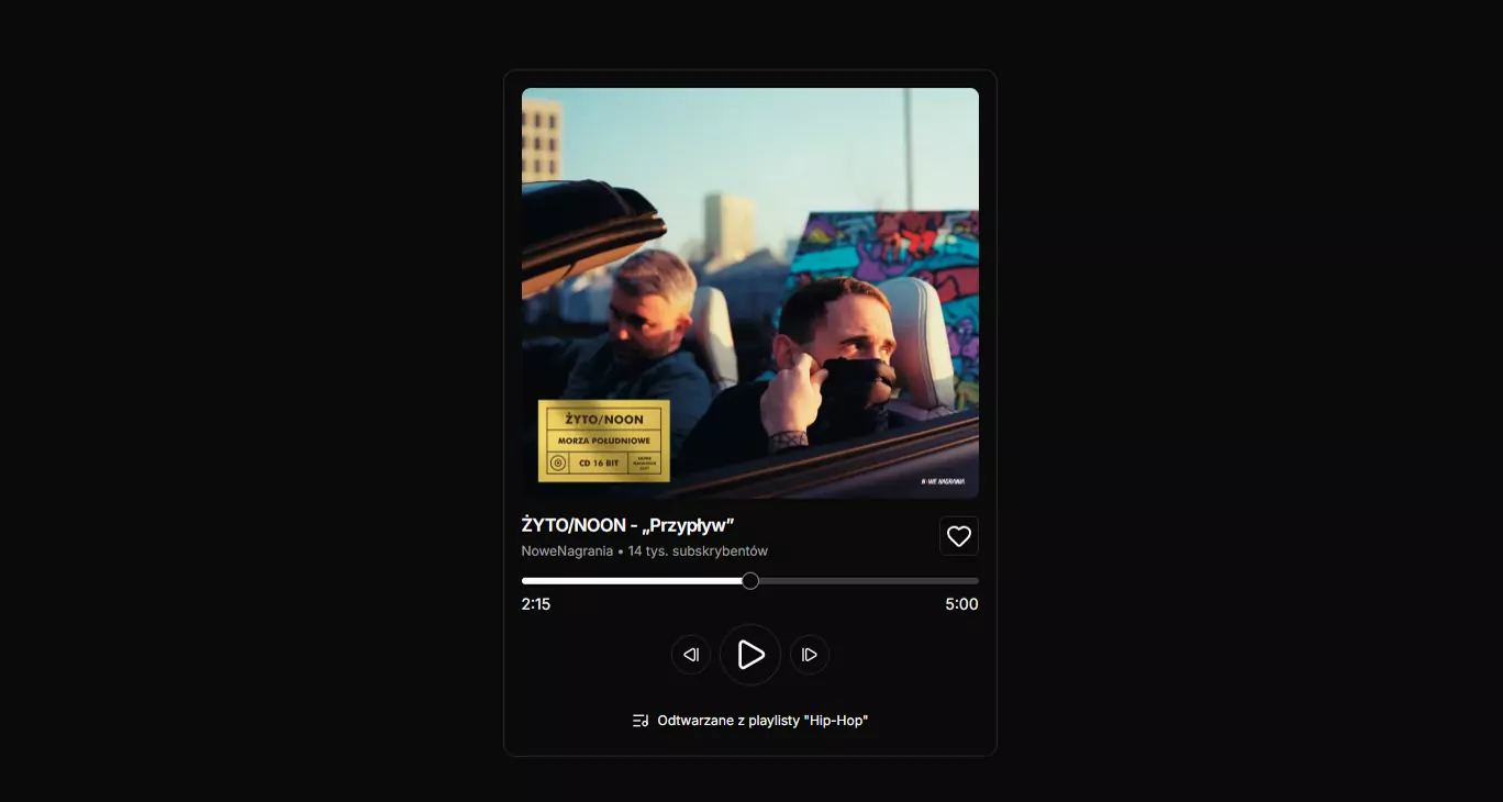
Today we get practical. Instead of a dull form, we are going to build something everyone carries in their pocket — a music player.
Why is this a great exercise to start with?
- A strong portfolio piece: for a modest amount of work we produce something that looks professional.
- Working with layout: we get to practise Flexbox inside components.
- Visual hierarchy: we learn to steer the reader's attention through text size and element scale (you can add colour later yourself).
🛠️ Step 1: Preparing the "bricks"
First we need an account at stackblitz.com.
Remember that shadcn is not a library we install wholesale? We pull only what we need.
Our player uses three elements:
- Card — our main container.
- Button — for the controls (play, pause, heart).
- Slider — for the track progress bar.
Open the terminal in your project (CodeSandbox/StackBlitz) and type:
npx shadcn@latest add card button slider
The icons (Heart, Play, StepBack and so on) come out of the box thanks to lucide-react, which installs automatically with shadcn.
🧬 Step 2: Building the file structure
We will build the component in app/page.tsx. Below is the complete structure of the file.
import {
  Card,
  CardHeader,
  CardTitle,
  CardDescription,
  CardContent,
  CardFooter,
} from "@/components/ui/card"
import { Heart, StepBack, Play, StepForward, ListMusic } from "lucide-react"
import { Slider } from "@/components/ui/slider"
import { Button } from "@/components/ui/button"

export default function Home() {
  return (
    <main className="p-4">
      <Card>
        <CardHeader>
          <img
            src="https://static.asfaltshop.pl/uploads2/photos/big_webp/2021/07/07/20210707033324_morza_poludniowe_cd_real_size_3000px.webp"
            alt="Zyto Morza Poludniowe"
          />
          <CardTitle>ŻYTO/NOON - „Przypływ”</CardTitle>
          <CardDescription>
            NoweNagrania • 14k subscribers
          </CardDescription>
          <Heart />
        </CardHeader>
        <CardContent>
          <Slider defaultValue={[50]} max={100} step={1} />
          <div>
            <span>2:15</span>
            <span>5:00</span>
          </div>
          <div>
            <Button>
              <StepBack />
            </Button>
            <Button>
              <Play />
            </Button>
            <Button>
              <StepForward />
            </Button>
          </div>
        </CardContent>
        <CardFooter>
          <ListMusic />
          <p>Playing from the "Hip-Hop" playlist</p>
        </CardFooter>
      </Card>
    </main>
  )
}
🎨 Step 3: Styling the file with Tailwind
Now let us style the whole thing so the player actually looks the part.
import {
  Card,
  CardHeader,
  CardTitle,
  CardDescription,
  CardContent,
  CardFooter,
} from "@/components/ui/card"
import { Heart, StepBack, Play, StepForward, ListMusic } from "lucide-react"
import { Slider } from "@/components/ui/slider"
import { Button } from "@/components/ui/button"

export default function Home() {
  return (
    // 1. BACKGROUND AND CENTRING (full screen)
    <main className="min-h-[100vh] w-full p-4 flex justify-center items-center bg-slate-50">
      {/* 2. THE MAIN CARD CONTAINER */}
      <Card className="min-w-[350px] max-w-[450px] shadow-xl">
        {/* A. HEADER: cover art + title + heart */}
        <CardHeader className="px-4 -my-2 space-y-4">
          <img
            src="https://static.asfaltshop.pl/uploads2/photos/big_webp/2021/07/07/20210707033324_morza_poludniowe_cd_real_size_3000px.webp"
            alt="Zyto Morza Poludniowe"
            className="rounded-lg aspect-square object-cover shadow-sm"
          />
          <div className="flex justify-between items-start">
            <div className="space-y-1">
              <CardTitle>ŻYTO/NOON - „Przypływ"</CardTitle>
              <CardDescription className="text-xs">
                NoweNagrania • 14k subscribers
              </CardDescription>
            </div>
            {/* The interactive heart */}
            <Button
              className="hover:text-red-500 hover:bg-transparent transition-colors"
              variant="outline"
              size="icon"
            >
              <Heart />
            </Button>
          </div>
        </CardHeader>

        {/* B. CONTENT: slider + transport controls */}
        <CardContent className="px-4 space-y-4 pt-4">
          <div className="space-y-2">
            <Slider defaultValue={[50]} max={100} step={1} />
            <div className="flex justify-between text-sm text-slate-500 font-medium">
              <span>2:15</span>
              <span>5:00</span>
            </div>
          </div>

          <div className="flex items-center justify-center gap-4">
            <Button className="rounded-full" variant="outline" size="icon">
              <StepBack className="w-4 h-4" />
            </Button>
            {/* The big play button */}
            <Button
              className="rounded-full w-14 h-14"
              variant="outline"
              size="icon"
            >
              <Play className="w-8 h-8 ml-1" />
            </Button>
            <Button className="rounded-full" variant="outline" size="icon">
              <StepForward className="w-4 h-4" />
            </Button>
          </div>
        </CardContent>

        {/* C. FOOTER: playlist information */}
        <CardFooter className="flex justify-center items-center gap-2 pt-2 pb-6">
          <ListMusic className="w-4 h-4 text-slate-500" />
          <p className="text-xs text-slate-500 font-medium">
            Playing from the "Hip-Hop" playlist
          </p>
        </CardFooter>
      </Card>
    </main>
  )
}
🧠 Analysis: why does this look good?
Let us look at the key techniques used in this project. They are what separates "an ordinary page" from "modern UI".
1. Typographic hierarchy (important vs less important)
Notice that not every piece of text is the same.
- Track title: we use
CardTitle, which is bold and larger by default. - Artist / subscribers: we used the class
text-xs(very small text) insideCardDescription. That way the reader's eye knows instantly what matters most. - Timestamps: grey (
text-slate-500) so they do not pull attention away from the slider.
2. The "space-between" layout
This is the most frequently used trick in UI. Look at the section with the title and the heart:
<div className="flex justify-between">
  <div>Title...</div>
  <Button>Heart</Button>
</div>
Thanks to flex justify-between, the title sticks to the left edge and the heart to the right, whatever the card's width.
3. Interaction details (micro-interactions)
Look at the "favourite" button (the heart). I added the classes hover:text-red-500 hover:bg-transparent. On hover the icon turns red, giving the reader immediate feedback. Small touches like these are what build a sense of quality.
4. Margin tricks
In CardHeader we used the class -my-2 (a negative vertical margin). Shadcn gives generous spacing by default. Sometimes — as here — we want the cover art and the title closer together. A negative margin lets us break the default rules and tighten the layout without ruining the rest of the card.
⚔️ A challenge for you
You have working code. Now rework it so that it expresses the track your player is showing:
- Change the track: swap the image
srcfor the cover of your favourite album. - "Active" mode: try changing the main play button (
variant="outline") to a filled one (variant="default") so it catches the eye more. - Colour experiment: can you make the progress bar (Slider) green, the way Spotify does it? Hint: you will need to look into the Tailwind config file or override the class inside the component.
Remember, the frontend is the art of arranging ready-made bricks into a good-looking whole. You have just taken a big step in that direction! 🚀
Happy coding!