Graphic Design: Your First Banner in Figma
A hands-on Figma workshop for beginners. Step by step we build a professional social media banner while meeting the key tools and good design habits.
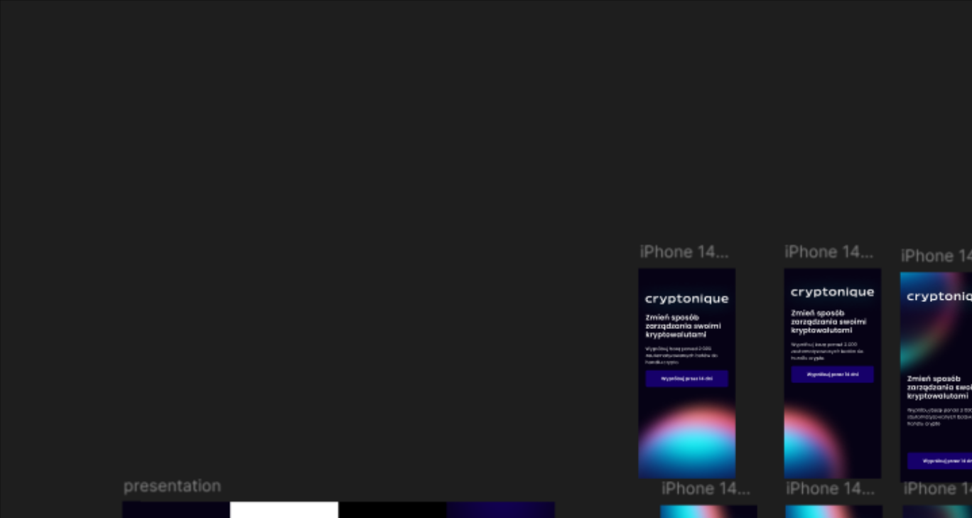
Hello, and welcome to the first practical graphic design class. 🎉 After a solid dose of theory it is time to make something real. Today we design an eye-catching social media banner from scratch in Figma — the absolute standard tool in the design world.
The goal of this lesson is not only to get to know the interface but, above all, to find your flow and see how simple design rules translate into a real result. Let's begin.
What is Figma (and why)?
Figma is a modern vector design tool that runs in the cloud. What does that mean for you?
- 🎨 Versatility: you can design anything in it — Instagram posts, application interfaces, complex design systems.
- ☁️ Accessibility: it runs in the browser on every operating system. No more installing heavy software.
- 🤝 Collaboration: several people can work on one file in real time. That was a revolution for teamwork.
Unlike older programs such as Photoshop, Figma was built for digital design, which makes it remarkably fast and intuitive.
Anatomy of the Figma interface
Before we start, let us look at the four key areas we will use today:
- Toolbar — at the top, holding the tools for creating things (frames, shapes, text).
- Layers panel — on the left, a list of every element in your project.
- Canvas — in the centre, your working space, where all the magic happens.
- Properties panel — on the right, where you change colours, sizes, fonts and other attributes of the selected element.
Workshop: building the banner step by step
Our goal is an Instagram banner measuring 1080×1080 px. The subject: "Autumn Coffee Sale".
Step 1: Setting up the workspace (Frame)
A frame is your container for the design.
- Click the Frame icon in the toolbar (shortcut:
F). - In the properties panel on the right, pick a ready-made template: Social Media → Instagram Post.
- Figma automatically creates a square 1080×1080 px frame. Name it "Banner" in the layers panel.
Step 2: Background and colours
Let us set the mood.
- Select the "Banner" frame.
- In the properties panel find the Fill section and click the colour swatch.
- Choose a warm, autumnal colour — orange (
#F2994A) or beige (#F3EADC), for example.
💡 Sites like
coolors.cowill help you find great colour palettes.
Step 3: Adding text
Text carries the message.
- Pick the Text tool from the toolbar (shortcut:
T). - Click on the frame and type the main headline, e.g. "Autumn Sale".
- In the properties panel (Text section) change the typeface to something legible and attractive (Poppins or Montserrat from Google Fonts, say), set a large size (96px, for example) and a heavy weight (Bold/Black).
- Add smaller text underneath, e.g. "-20% on all coffee", in a smaller size.
Step 4: Placing images and shapes
Let us enrich the design visually.
- Find a free photo of a coffee cup (on
unsplash.comorpexels.com). - Drag and drop the
.jpgfile straight onto the Figma canvas. - To crop the photo in an interesting way we will use a mask. Draw a shape (a circle with the Ellipse tool — shortcut
O) over the photo. - In the layers panel select both the photo and the shape (holding
Shift). - Click Use as Mask in the top bar. The photo is clipped to the circle.
Step 5: Composition and alignment
Order is the key to a professional look.
- Arrange the elements, leaving some breathing room between them — white space.
- Select several elements (holding
Shift) and use the alignment icons in the properties panel to centre them perfectly or align them to an edge.
Step 6: Exporting the graphic
Time to share your work with the world.
- Select the "Banner" frame in the layers panel.
- At the very bottom of the properties panel find the Export section.
- Choose JPG (for photographs) or PNG (if you have transparency).
- Click Export Banner. Done.
Good habits for beginners
- Visual hierarchy: the most important element (the main headline, usually) should be the largest and heaviest. Lead the viewer's eye.
- Legibility is king: make sure the text has enough contrast against the background. Dark text on light — or the other way round — is always a safe choice.
- Consistency: limit yourself to one or two typefaces and two or three main colours. Less is more.
- Name your layers: instead of "Rectangle 1" and "Ellipse 2", use "Photo background" and "Button". It makes the work enormously easier.
Practice exercise
Your own composition
Now it is your turn. Using the techniques you have learned, make a second banner.
- Subject: anything you like (a book sale, an event invitation, a motivational quote).
- Dimensions: this time try a graphic for Facebook or Twitter (find the right template under Frames).
- Requirements: use at least one photo, a headline, additional text and a graphic element (a shape). Remember the alignment.
Summary
Congratulations — you have just made your first professional design in Figma. The key points from today:
- ✅ Figma is a powerful and accessible design tool.
- ✅ Making a graphic is a sequence of steps: Frame → Background → Text → Images/Shapes → Composition → Export.
- ✅ Good habits (hierarchy, contrast, consistency) matter more than knowing every tool.
Next steps
In the coming lessons we dive into more advanced topics:
- Auto Layout: building flexible, responsive components.
- Components: creating reusable interface elements.
- Prototyping basics: linking screens into interactive mockups.
Useful links
- Figma Learn — official tutorials and courses from Figma's makers
- Google Fonts — an enormous library of free, high-quality typefaces
- Unsplash — beautiful, free photos for your projects
- Coolors.co — a colour palette generator
Questions? Problems? Write to me at m@zeprzalka.com
Happy designing! 🚀