Building Websites With AI: From Prompt to Production
A compendium on prompt engineering: the CRISPE method, a survey of the tools (Cursor, Copilot) and a workflow that genuinely speeds up work on sites and apps.
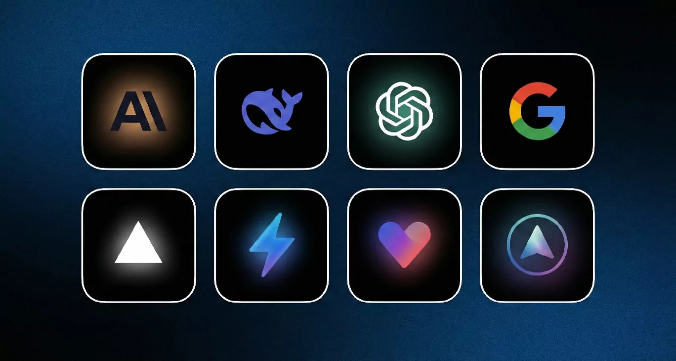
Welcome aboard the course! 🚀
If you think AI in programming exists only to "write an HTML heading", you are mistaken. Today's class — and this article — is the proverbial red pill that changes how you see AI in web development.
You already have the foundations: HTML, CSS, Git, Vercel. That is your base. But the market has shifted dramatically. Today the winner is not whoever types fastest. The winner is whoever can manage a fleet of AI models and deliver flawless code several times faster.
AI alone is not enough, of course. It can become a trap of endless fruitless attempts to reach the result you want. On the other hand, a radical stance of coding everything by hand can leave you far behind. A hybrid approach currently looks like the best answer.
I have prepared a compendium that will take you from "user" to "junior AI engineer".
🧰 Part 1: A survey of the tools (the 2025 ecosystem)
Do not get attached to version numbers (3.5, 4, 5.1…). Model names and versions change constantly. As professionals you need to know the classes of tool and where to look for the current leader — and how to match a tool to a problem. The only effective method is to work the project attached to this article through several different workflows.
0. UX/UI generators
Although this material is about web development, when you have a moment I recommend getting to know at least one tool that generates wireframes and visual schemes for websites. It is a great support for the final coded page.
-
Relume – fast visual prototypes
- Why: perfect for quick mockups and wireframes; working with a designer you can arrive at an ideal visual design for your site.
- Use: producing a prototype you can export and edit in Figma.
1. Large language models (LLMs) — the brain of the operation
This is where we generate logic and structure, and refactor code.
-
Claude (Anthropic) – 👑 the coding king.
- Why: a model known for a warmer, more human approach and an excellent grasp of technical context. It generates very clean, modern code and invents non-existent CSS classes less often than the competition.
- Use: chief code architect, complex refactors.
-
DeepSeek – 🦄 the dark horse (open/free).
- Why: an open-weight model that shook the market by offering the performance of the paid giants for a fraction of the cost, or for nothing. Excellent in Python and JavaScript.
- Use: day-to-day work, quick scripts, debugging.
-
ChatGPT (OpenAI) – 🛠️ the Swiss army knife.
- Why: the best at "understanding the world" and at multimodality (it sees images, hears voice). Reach for it when you need copy for a page or an analysis of a design screenshot.
- Use: copywriting, image analysis (vision), brainstorming.
-
Gemini (Google) – 📚 the librarian with an enormous memory.
- Why: it offers the largest context window on the market. You can paste in the entire documentation of a new library or all the code of an old project and ask about a single variable.
- Use: working with huge data sets and long files.
💡 Pro tip: where do you check which models are currently best in each category? Do not trust the marketing. Check LM Arena. It is an open ranking where the community picks the best model in blind tests.
2. Generative UI — from text to interface (visual coding)
Tools that "see and render" code in real time. No more copying individual divs.
- v0.dev (Vercel) – the React/Tailwind standard.
- A tool from the makers of Next.js. It generates finished components (shadcn/ui) perfectly optimised for the modern stack.
- Bolt.new (StackBlitz) – full-stack in the browser.
- Not only UI. Bolt can stand up a whole application with a backend and a database. You can edit the code in it as you would in VS Code.
- Lovable.dev – good design.
- Focused on aesthetics and UX. If you want a "wow" effect without long styling sessions, this is a good direction.
3. AI-native IDEs — the future of code editors
A code editor is no longer a notepad; it is a pilot's cockpit.
- GitHub Copilot – a VS Code extension
- An excellent solution combining several AI models. It works in the most popular code editor, VS Code.
- Cursor – an IDE with AI built in
- A fork of VS Code with AI at its core. Cursor indexes your local files, so it knows everything about the project. You do not have to copy code into a chat — it is already there.
- Windsurf – the new player (an editor with "flow").
- An editor from the makers of Codeium. Its "Cascades" feature lets it understand the flow of data across the whole application, not just the open file.
🧠 Part 2: Prompt engineering, PRO level
Most people write: "Make me a nice website…". That is a mistake. An LLM is a machine — the quality of the output depends on the quality of the context you give it.
Here are the techniques that separate amateurs from engineers.
1. Zero-shot vs few-shot prompting (the key to style)
-
Zero-shot (no examples): the model relies only on its general knowledge.
- Prompt: "Write a button in HTML."
- Result: you get a generic, ugly button. Risky.
-
Few-shot (with examples): you give the model a pattern (input -> output) to stick to. This is the most important technique for developers when you want to keep your code consistent.
An example (few-shot): > "I want to create a product card. This is how we write cards in our project (the pattern): >
<div class="card p-4 shadow-lg rounded-xl">...</div>> Now generate the same card, but for the product 'AI Course' priced at 200 PLN. It is worth using design terminology: a card with rounded corners, casting a shadow, in the Material Design style, and so on."
2. Chain-of-thought (CoT)
LLMs sometimes guess at an answer. The chain-of-thought technique forces the model to think first and write code second. It cuts logic errors (in JS/TS) dramatically.
- How do you do it? Add a sentence to your prompt: "Before you write any code, analyse the problem step by step and set out a plan."
3. Structure: the CRISPE framework
To make your prompt complete and legible to an AI, use the CRISPE framework. Each letter is an element your instruction has to contain:
- CR - Capacity and Role: define the role the model should take on. Should it be a copywriter, a researcher or a senior developer? Setting this out up front steers the whole answer.
- I - Insight (context): give the necessary background and context. The more detail the model receives, the more accurate the response.
- S - Statement (the instruction): the heart of your prompt. What exactly do you want the AI to do? Be as precise as you can.
- P - Personality (style): how should the model sound? Formal and businesslike, or relaxed and friendly?
- E - Experiment (variants): ask for several versions or examples so you can pick the best or combine elements from different options. Essential in design work.
4. A visual vocabulary (speak the language of design)
An AI does not see; it reads images. You have to use precise terms in your prompts. Instead of "make some nice buttons", write:
- Shape: "pill-shaped buttons" vs "sharp-edged rectangles" vs "slightly rounded" (
rounded-md). - Shadows: "soft drop shadow" vs "flat design" vs "neumorphism".
- Space: "airy layout with extensive whitespace" vs "compact, data-dense grid".
- Hierarchy: "visual hierarchy focused on typography" vs "image-driven layout".
⚔️ Part 3: A practical exercise — "University 2.0"
We take on a real challenge.
Client: Civitas University.
Goal: redesign the home page. Combining academic gravity with the modernity of the current web.
🧪 THE MODEL PROMPT (the CRISPE framework)
Here is a prompt prepared for you. Edit it as you see fit and fill in any details. Want to do it entirely differently? No problem, but remember the good habits. It is only a minimal outline meant to point you in a direction, and at this stage it may not give a fully satisfying result.
(CR) CAPACITY & ROLE: Take on the role of a lead frontend developer and UI/UX designer with many years of experience and dozens of award-winning projects behind you, specialising in the higher education sector. You are an expert in Tailwind CSS, accessibility (WCAG 2.1) and conversion rate optimisation (CRO).
(I) INSIGHT (context): We are redesigning the home page for "Civitas University", a prestigious university in Warsaw. The current site is outdated. The new design must combine 25 years of academic tradition with a modern, tech-savvy look that will attract Generation Z students. Design system:
- Colours: deep navy blue (primary — echoing the branding) plus greys and white (a neutral background).
- Typography: serif headings (Playfair Display, say) for prestige, a sans-serif body face (Inter, say) for legibility.
- Layout: plenty of room ("airy layout"), avoiding crowding.
(S) STATEMENT (the task): Generate complete, responsive HTML/CSS for a landing page. Use Tailwind CSS (imported via CDN) and produce a single
index.html. The page structure:
- Navbar (sticky, with a clear split in the menu: "For Students" vs "For Applicants").
- Hero section (headline: "The future starts here", a subheading and two CTA buttons).
- A features grid (three columns with icons, e.g. "A practical approach", "Prestige").
- Testimonials (opinions from graduates).
(P) PERSONALITY (code style): The code should be senior level — clean, semantic (use
<section>,<nav>,<header>) and well commented. Visually the page should feel premium, trustworthy and modern.(E) EXPERIMENT: Produce two button variants for the hero section in the code (comment one out, or show both for comparison):
- Option A: pill-shaped buttons (
rounded-full) with soft shadows (a soft UI style).- Option B: sharp, rectangular buttons (
rounded-none) with a thick outline (a brutalist, contemporary style).
Your workflow for the exercise (about 90 minutes):
- Analysis (10 min): choose a style (option A or B in the prompt). Decide whether you prefer a modern vibe or a classical one.
- Generation (30 min): use an LLM, or any other model, with the prompt above adapted to your needs.
- Refinement (iteration):
- Prompt 2: "The hero section takes up too much room on mobile. Halve the vertical padding on screens below
md." - Prompt 3: "Change the CTA button colour to a gradient from light blue to deep blue."
- Prompt 2: "The hero section takes up too much room on mobile. Halve the vertical padding on screens below
- Deploy: GitHub + Vercel — we are building a complete portfolio.
🏆 What is being graded?
- Engineering quality: is the code clean? Is the page free of glaring errors, and does it display correctly?
- Design awareness: did you stick consistently to the chosen style (buttons, brand colours)?
- Responsiveness: tested on every device.
🎯 Summary
Building websites in 2025 is a dialogue with technology. Your task is not to memorise every CSS property but to be able to describe how things behave and look in language a model understands.
Get to work — and may the first green tiles appear in your repositories. Good luck! 🟢